Brussels kitchens, reimagined through design and symbolism
This project was part of a visual identity competition for Les Cuisines Bruxelloises, a public organisation dedicated to promoting balanced and sustainable nutrition in schools and social institutions across Brussels.
The challenge was to create a logo that embodies their values of health, ecology and regional pride.
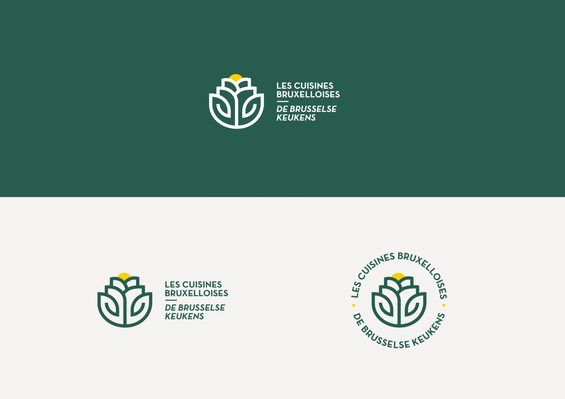
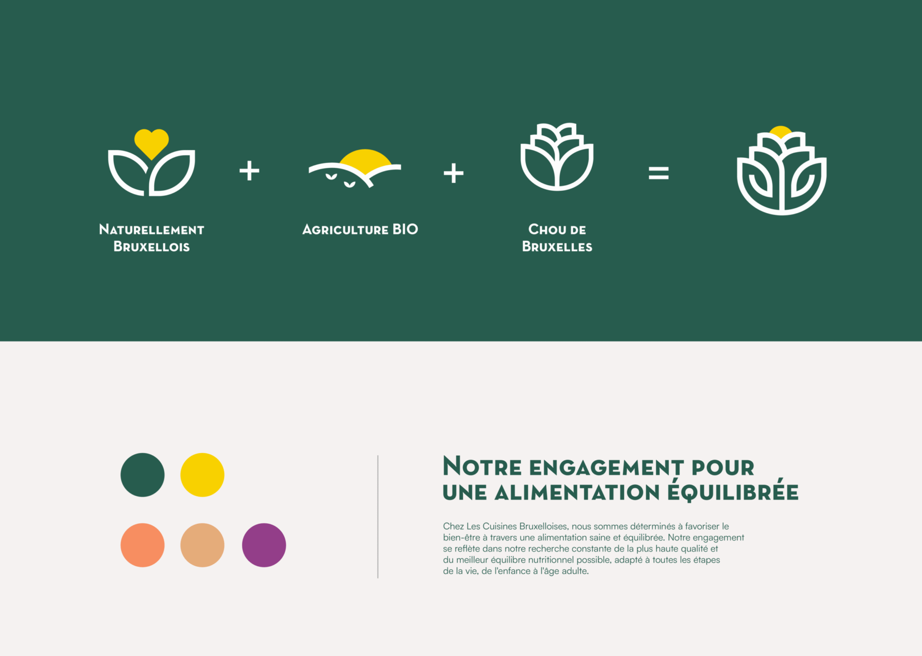
The concept is built around a stylised Brussels sprout, symbolising both the city’s name and its commitment to local, organic agriculture. The design combines three key elements: a rising sun representing growth and vitality, a meadow evoking natural harmony, and geometric lines inspired by the iris, Brussels’ emblematic flower. Together, they form a unified mark that reflects sustainability, care and community.
The visual identity adopts a clean and modern approach, using soft yet vibrant colours that convey freshness and balance. The deep green palette evokes nature and trust, while the touch of yellow introduces warmth and optimism.
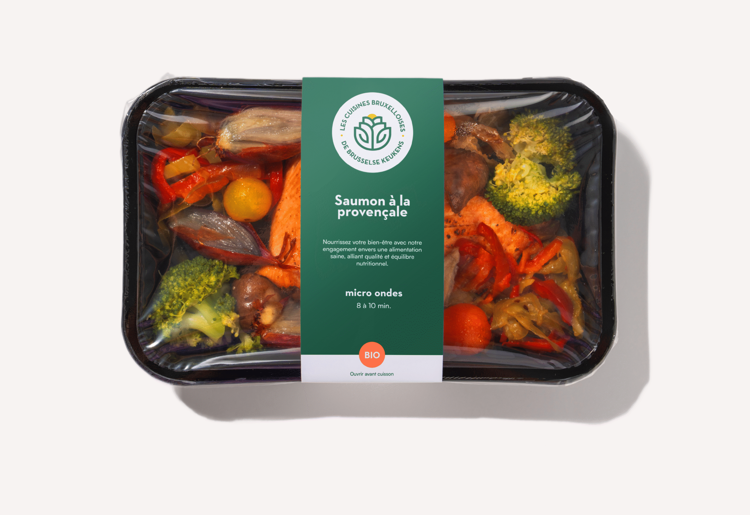
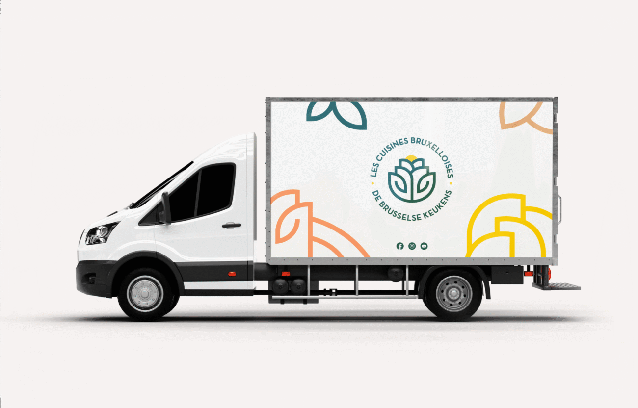
This simple, scalable symbol functions across packaging, vehicles and communication materials, visually reinforcing the organisation’s mission to make healthy food accessible to everyone in the region.
